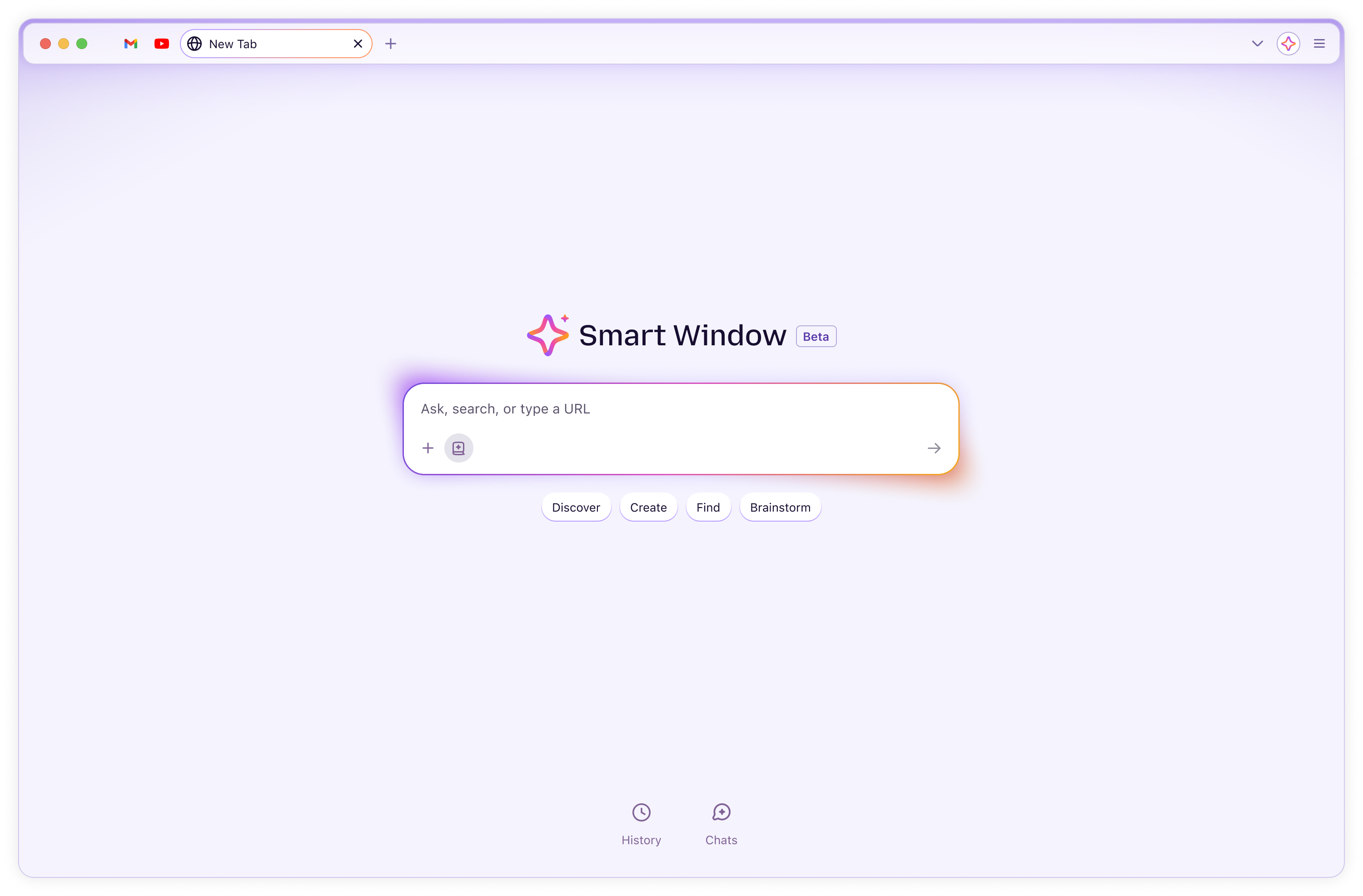
Softening the hard edges
The active tab floats as a rounded pill and the content window carries a consistent radius. Small moves that take the tension out and make the surface feel considered, not boxed-in.
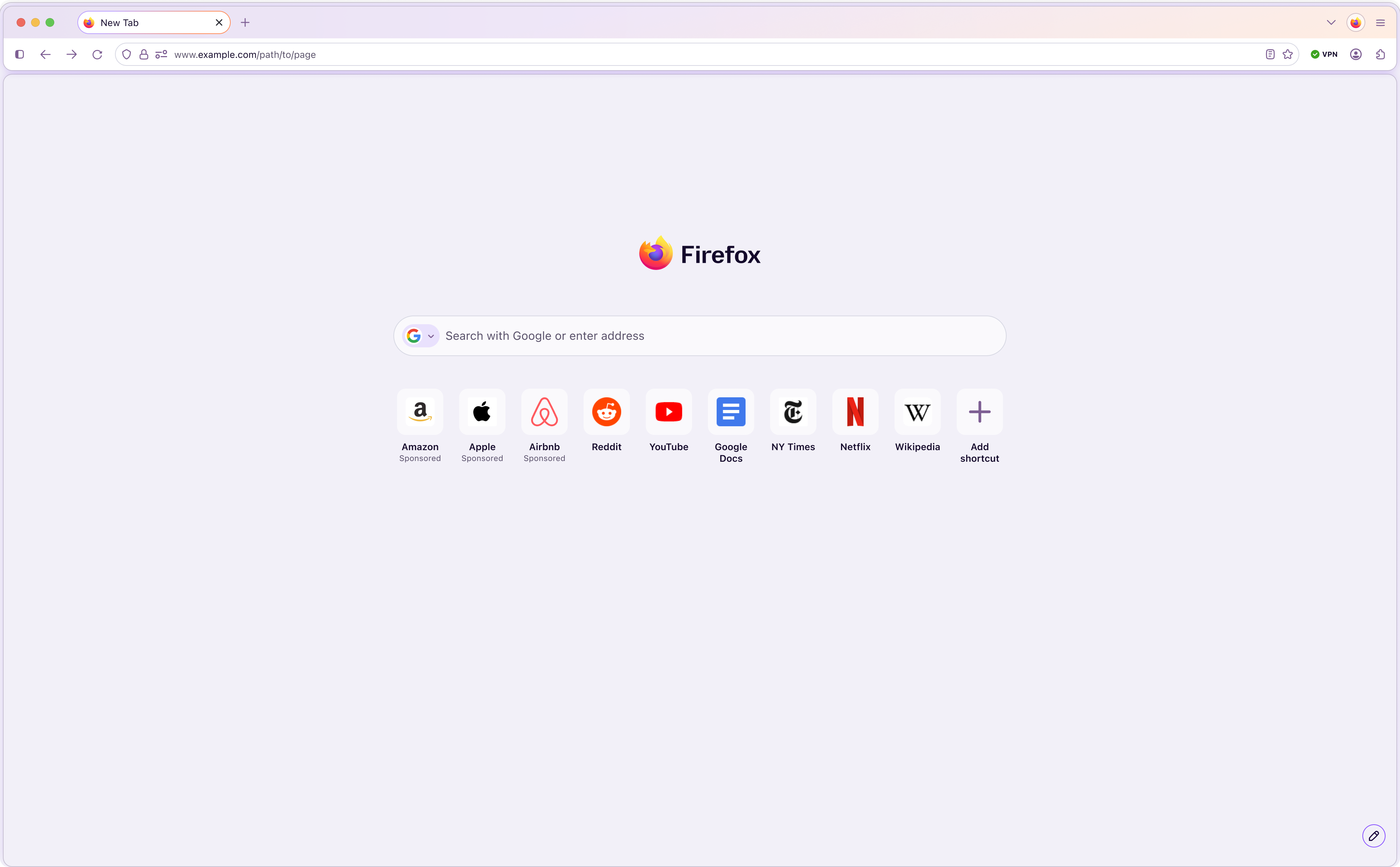
The tab shape is intentional, not decoration. A distinct Firefox identity with a concrete rationale, so it reads as a decision rather than difference for its own sake.
Tab corner-radius
SHIPPINGDirect from community feedback after the initial redesign, now yours to set.
Make it yours
Firefox's ethos is control over your own experience. Split windows, vertical tabs, and Compact Mode let people reshape the browser around how they actually work, long-standing community asks we now ship.
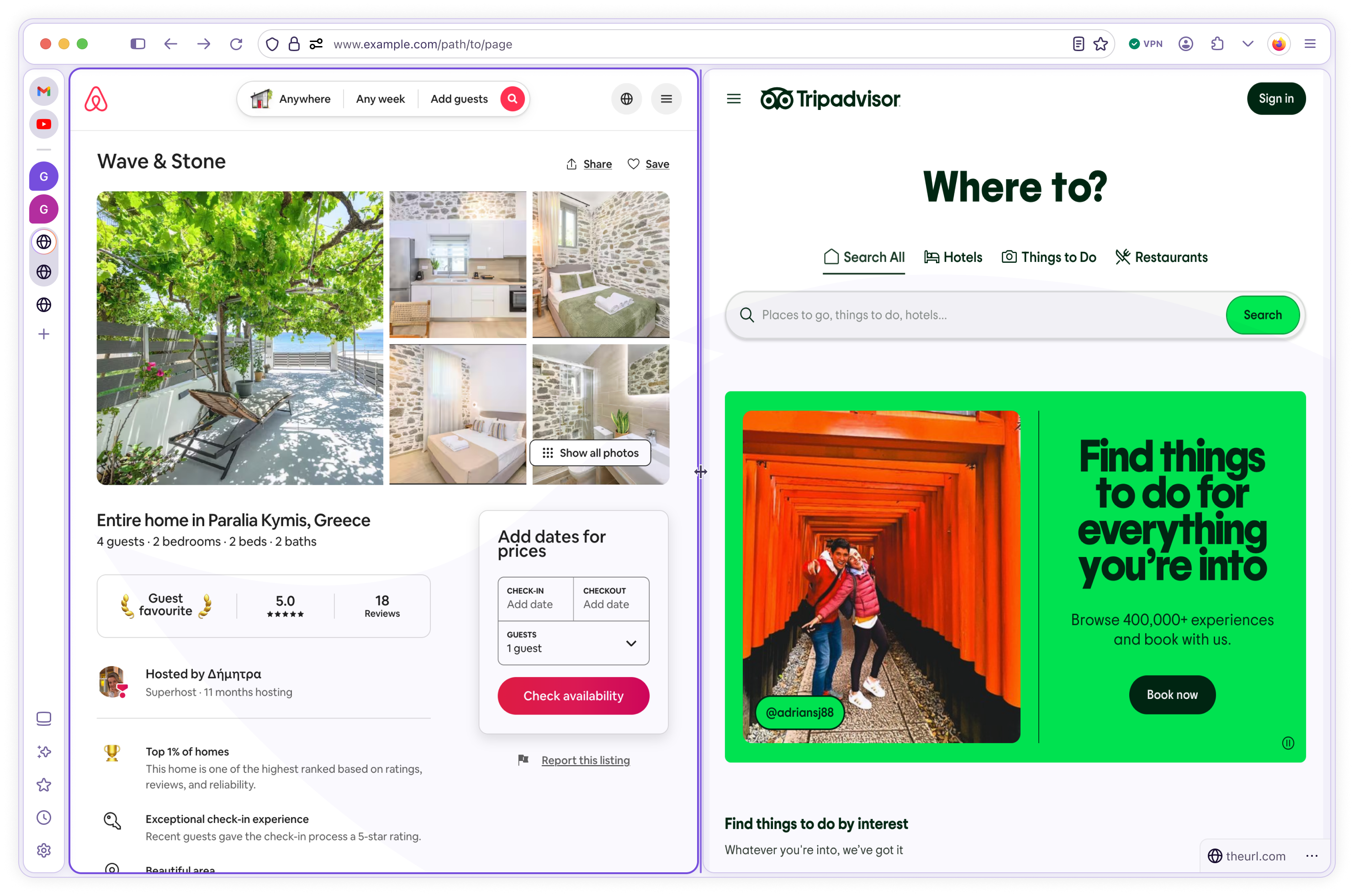
Customization is a stance, not a settings screen. The browser bends to how each person works instead of asking them to adapt to it.
Compact Mode
SHIPPINGA long-time community ask, now offered. Flexible layouts for people who want density.
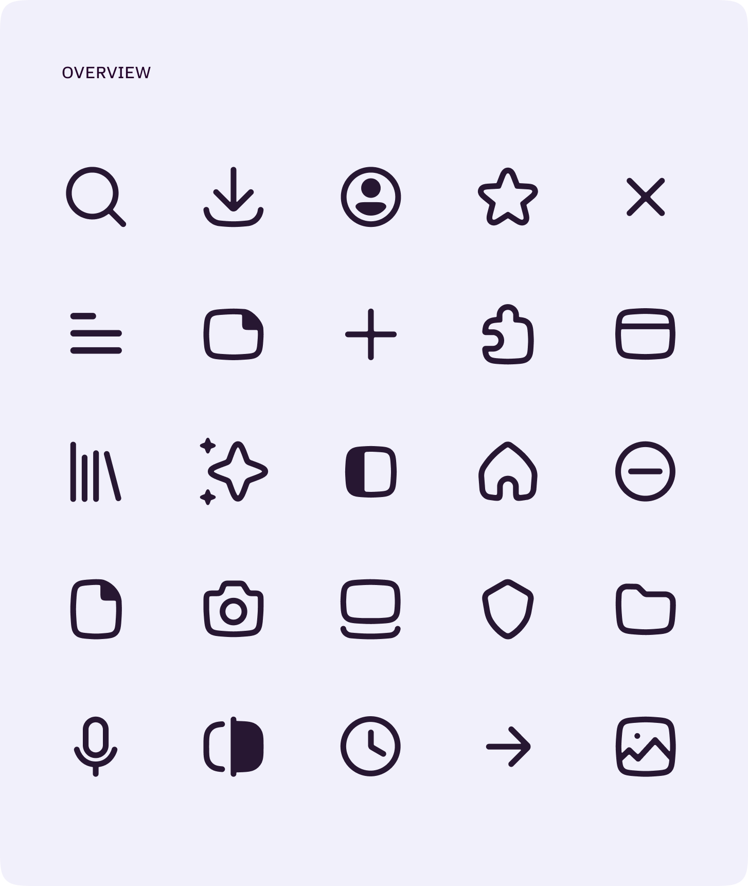
One icon language
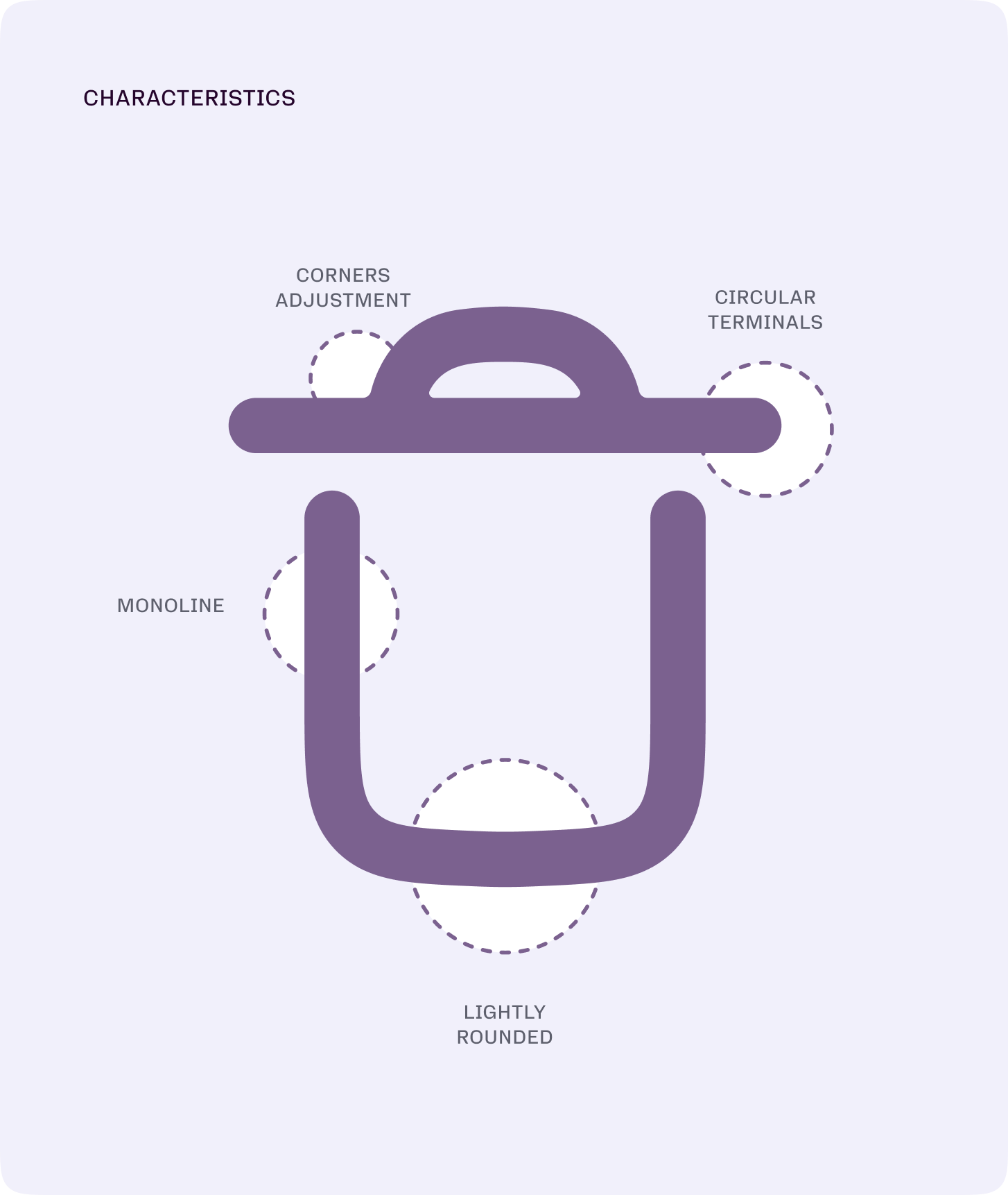
The same construction rules that shaped the tabs run through the icons: monoline strokes, lightly rounded corners, and circular terminals. Cohesion you feel before you can name it.
the_bet · strategy
Retention was the business problem, not a redesign brief
01 — The problem
Firefox was losing users to Chrome faster than it could win them. A visual refresh would not move that. The real problem was retention: the browser felt dated, heavy, and impersonal against competitors investing billions.
02 — The wedge
I made retention the design north star and bet on one system, not two products. Tokenizing desktop and mobile together let a small org ship a coherent redesign at platform scale and made room for opt-in AI without a second rebuild.
03 — The org I built to ship it
I directed 27 designers across 15 concurrent workstreams as a leader of leaders, through four senior managers, in close partnership with PM and engineering. That structure is what turned the bet into a rollout now live to 30K in Nightly, heading toward 132M MAU at major release.
The through-line
The web got busier and more complex. Firefox should help you focus, not compete for your attention. The redesign takes some of the tension out of the interface, then earns a distinct identity back through the details.
The foundation
It stopped being a paint job and became a platform
We tokenized the whole surface: every color, spacing value, and corner radius now resolves to one source of truth instead of one-offs scattered through the code.
That is what turned a redesign into a platform. New features ship faster, stay cohesive across desktop and mobile, and every future iteration compounds on the same foundation.
Built in the open
Built with its community, not just for it
The early design leaked to Reddit. We listened rather than getting defensive, and real feedback shaped the final result. Iteration is part of the process.
Even the current version in Nightly looks so much better than any previous Firefox design.
Mozilla Connect · public
FIREFOX + VENMO
MORE CASES

Want the full case study?
The complete deck covers the decision registry, token trajectory, and community loop. Email me and I'll send it over.